Learn how to structure roles, RACI, SLAs, and escalation paths for fleet brand management across locations and vendors to stay consistent at scale.
Learn how commercial van wraps turn delivery vans into mobile billboards, strengthening brand visibility and generating leads in every market.

Learn how fleet vehicle wraps support ESG and sustainability goals with greener materials, smarter rollouts, and consistent brand visibility nationwide.
Use a QA and QC framework for nationwide fleet graphics with checklists, tolerances, photo audits, and clear acceptance criteria by vehicle class and installer.
Learn how to create cohesive, durable commercial signage solutions that scale across locations while keeping your brand consistent and highly visible.

Learn how enterprise teams standardize and streamline commercial signage solutions across locations with consistent design, production, and installs nationwide.
Learn how commercial vehicle wraps can deliver consistent, long-term brand impact across your fleet with smart planning and maintenance strategies
Learn why enterprises question in-house wrapping and how an enterprise vehicle wrap vendor improves quality, speed, and nationwide consistency
Learn how fleet branding services unify vehicle graphics and exterior signage to deliver consistent, recognizable branding across every location and route
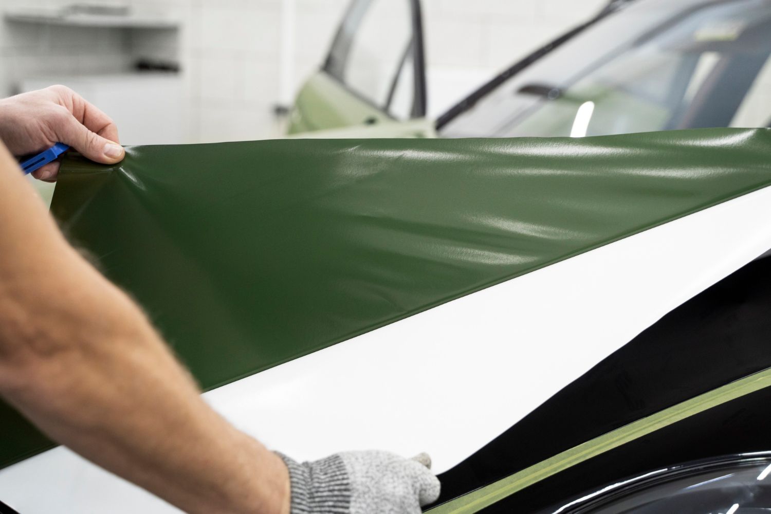
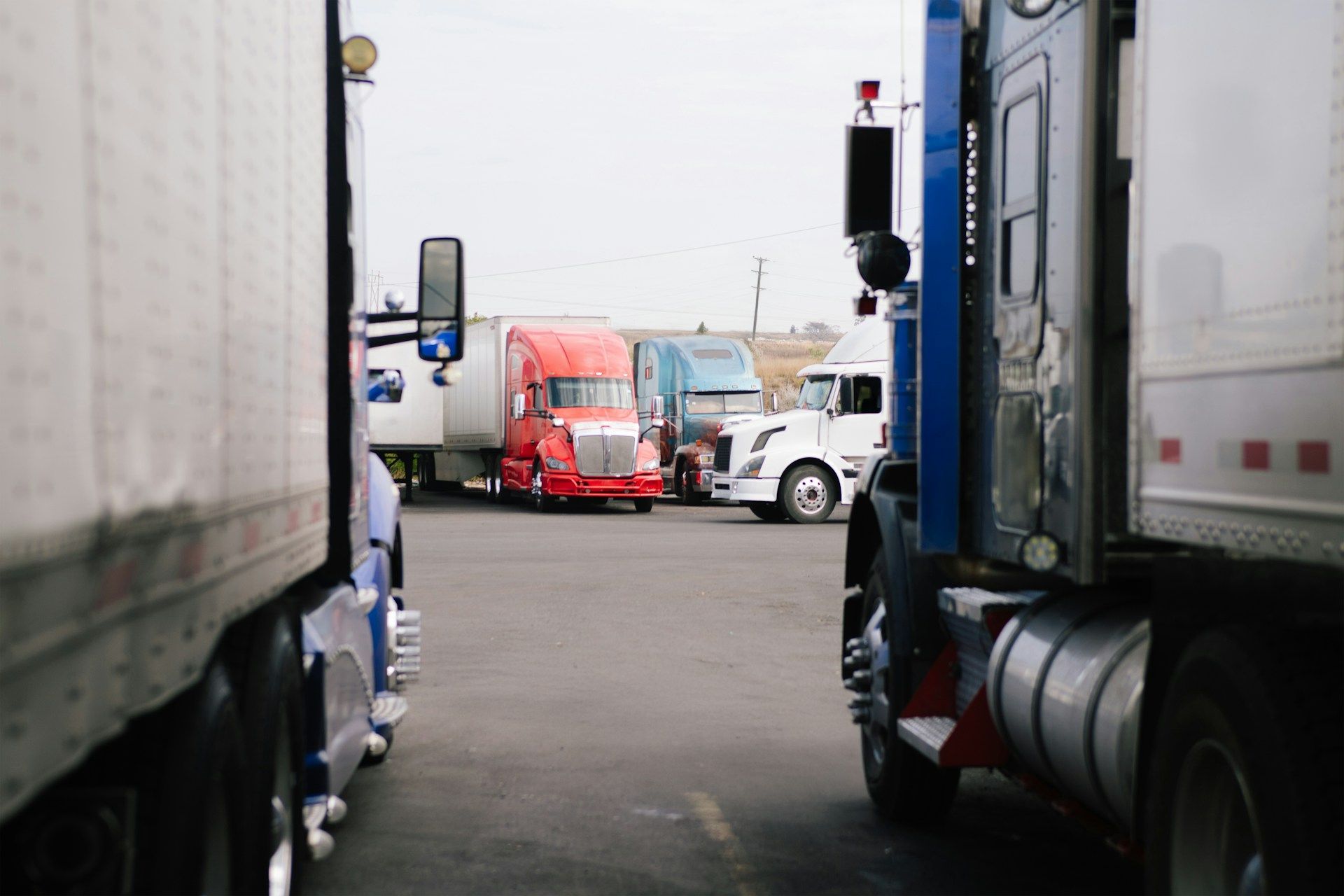
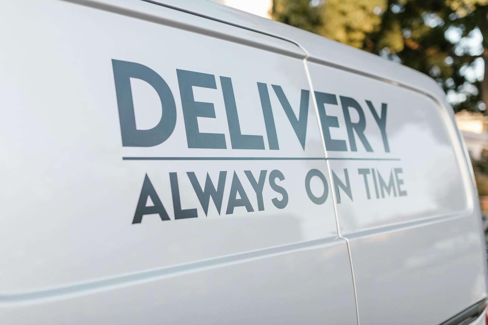
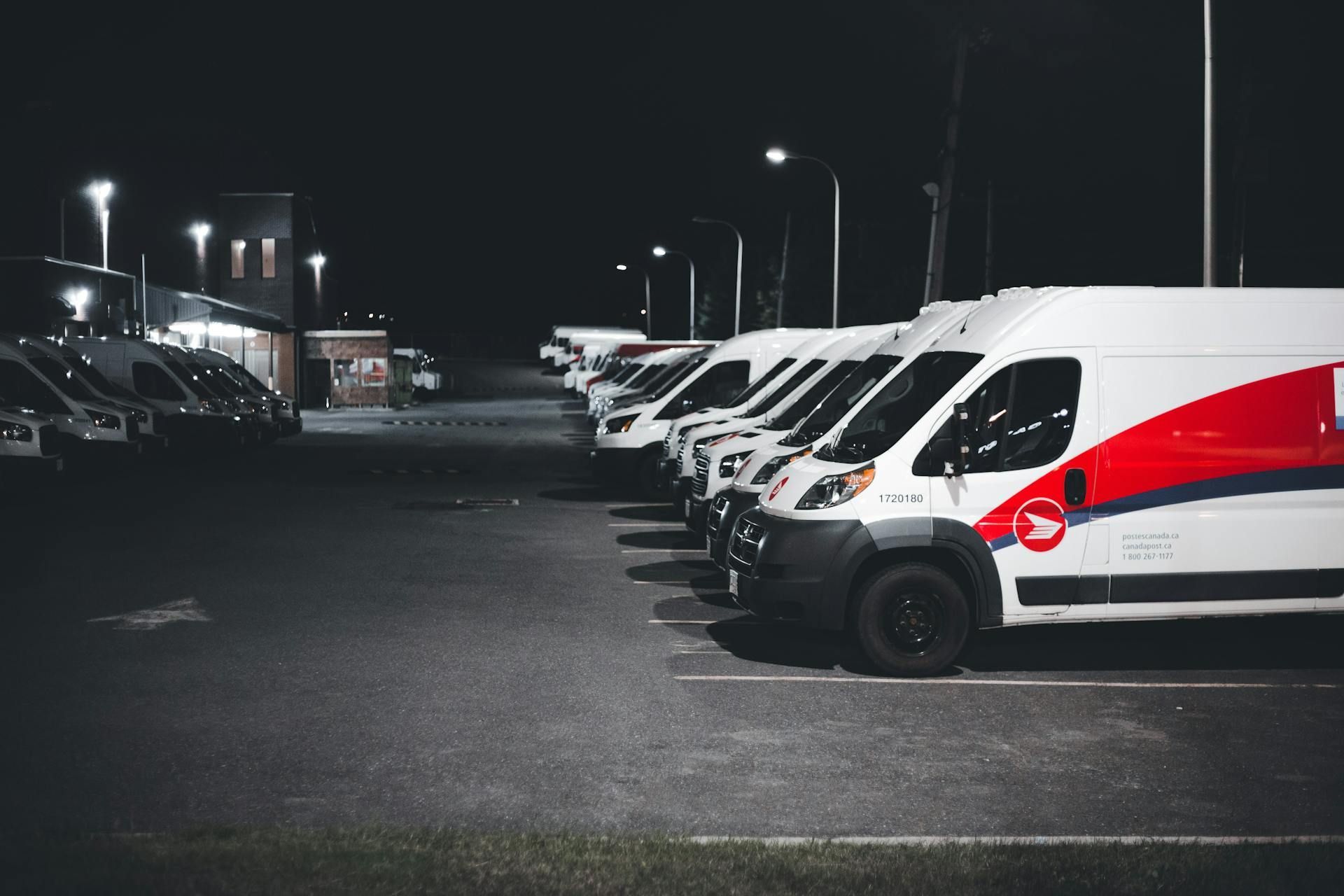
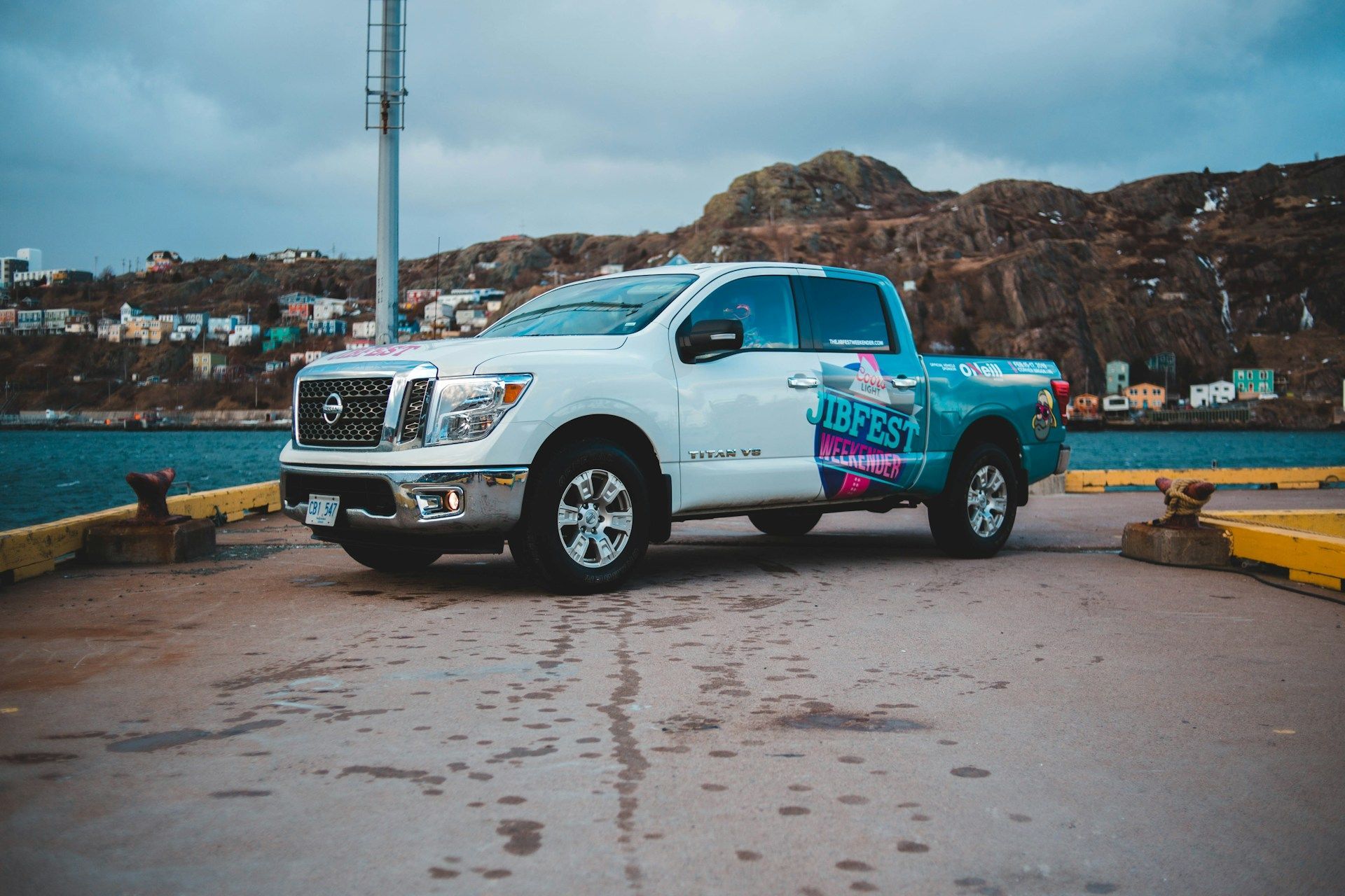
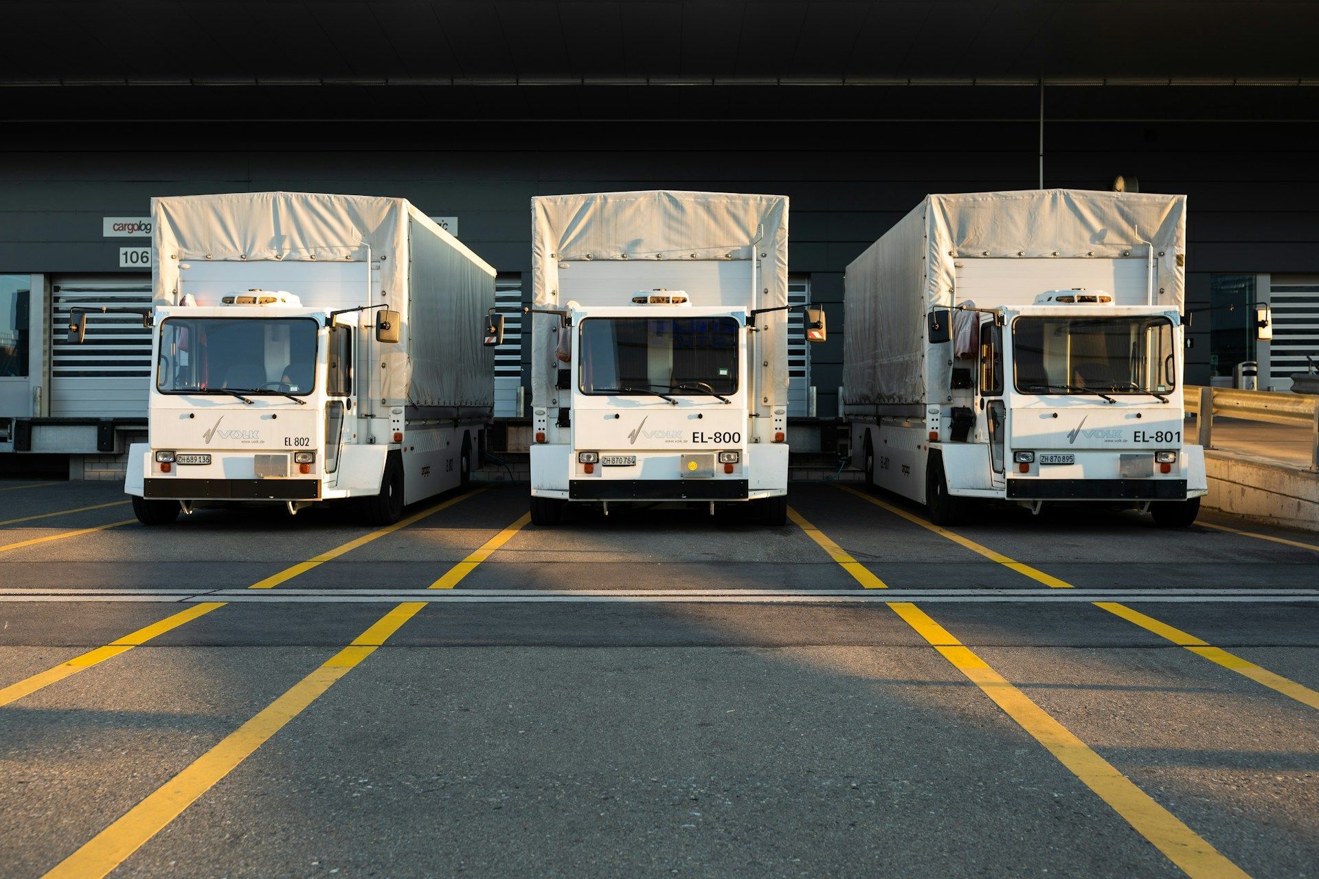
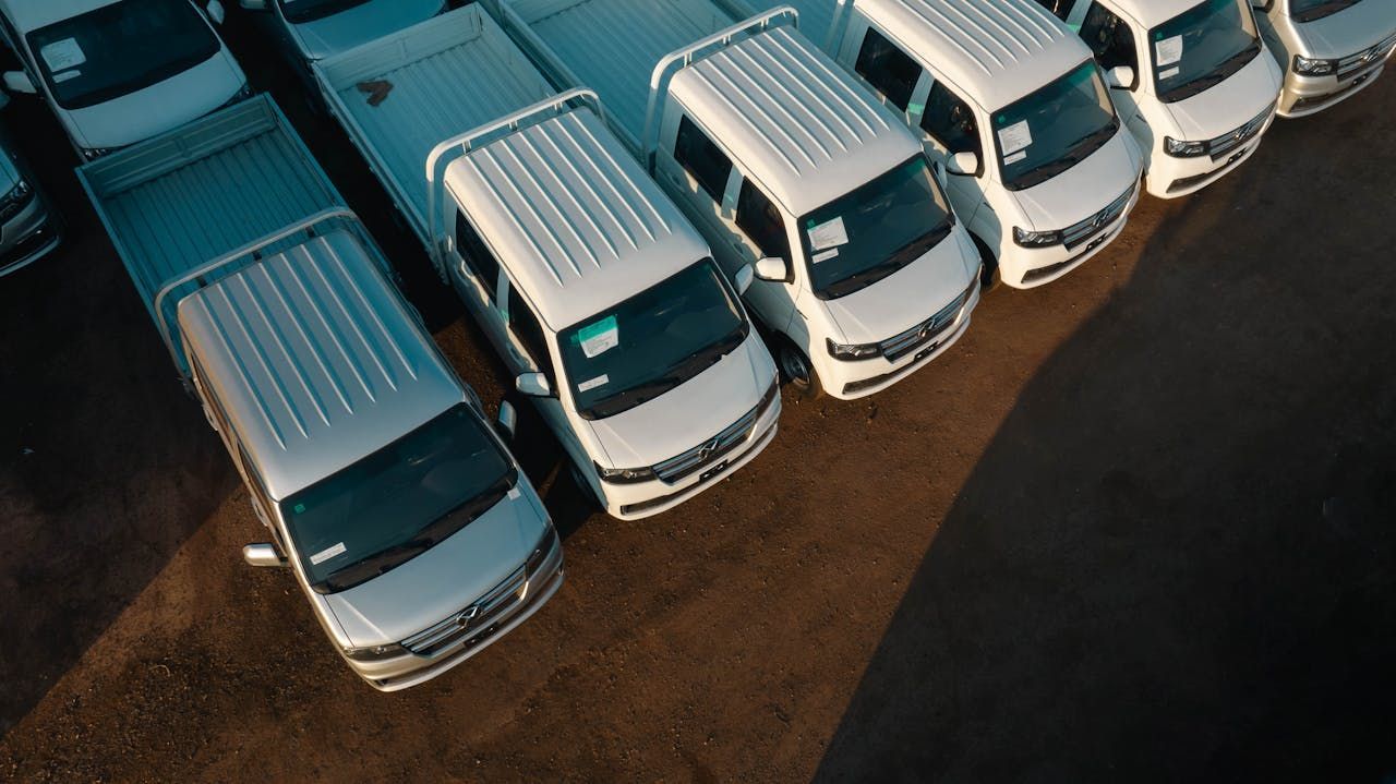
Turn Fleet Wrap Chaos Into a Repeatable Win Fleet wrap installation across many locations can get messy fast. A few missed details, one rainy parking lot, or a poorly prepped van, and suddenly schedules slip, wraps fail, and drivers are waiting around. Every extra day a vehicle sits still is lost exposure and missed momentum for your brand. This is why installer-ready playbooks matter. When corporate teams, local managers, and installers all follow the same simple, clear standards, the chaos settles down. Site readiness, vehicle prep, and clean handoffs stop being guesswork and start becoming a repeatable win in every market, building dependable brand visibility mile after mile. At AGS, we live in that world of moving parts, logistics, and deadlines. As a nationwide fleet graphics and signage partner, we see what works and what slows fleets down. We partner with brands to turn complex rollouts into precise, predictable programs. In this article, we will walk through practical, installer-ready playbooks you can put in place so your wraps roll out faster, look sharper, and stay consistent across every city your brand touches, strengthening recognition every time your vehicles hit the road. Why Repeatable Fleet Wrap Standards Beat One-Off Heroics Many brands quietly lean on “hero” installers. You know the type: the person who can fix a bad file on the fly, adjust artwork at the last minute, and somehow pull off a clean wrap in a parking lot with poor light. That can work for a handful of vehicles. It does not hold up when you are rolling out hundreds across the country and aiming for a powerful, unified brand presence. When every location runs installs a different way, you get: Inconsistent finishes from market to market Wrong vinyl or laminate choices for certain climates Misread brand specs and off-tone colors Timelines that wobble with every scheduling change Uneven brand impact from one region to the next Playbooks give your team one shared play. They are written, repeatable procedures for fleet wrap installation that travel from city to city. They tell each local site what “ready” means, what success looks like, and how to handle edge cases, so every install supports the same strong brand story. Clear standards also make planning easier. Your internal schedulers can line up installs around driver shifts. Your marketing team can time launches for when roads get busier in spring and summer. When everyone knows the steps, no one has to guess, and your brand shows up on the road exactly when and where you want it to. Site-Ready Playbooks That Keep Installs on Schedule A site is “ready” when installers can work safely, efficiently, and without surprises. That usually means more than “we have a parking lot.” The right setup accelerates every step and protects the quality of your wraps. Strong site readiness covers things like: An indoor bay or a tented space when the weather is rough Power access and steady lighting Clean, open work areas with room to move ladders and tools Safe vehicle staging that does not block traffic or fire lanes A simple site readiness checklist for local teams might include: Access windows, gate codes, and security rules Parking layout, including where vehicles wait and where they move next Loading and unloading zones for graphics and tools Weather plans for rain, wind, snow, or extreme heat Any local rules for noise, hours, or safety gear Central teams can send this playbook to every branch before installs start. It can include diagrams that show traffic flow, photos of “good” and “bad” workspaces, and a short briefing sheet for the on-site contact. The goal is to remove mystery before installers arrive so the whole team can focus on quality and speed. Strong logistics are the glue here. When installers get clear arrival instructions, updated site maps, and a current contact list, they waste less time tracking down details and more time wrapping vehicles. That really matters when you are stacking multiple installs in the same market on tight timelines and working to launch a coordinated, visible brand presence. Vehicle Prep Standards That Protect Your Brand on the Road You can put perfect graphics on a poorly prepped vehicle and still end up with bubbles, lifting edges, and early failure. Prep is where long-lasting wraps and reliable brand impressions begin. An “installer-ready” vehicle should be: Fully washed and rinsed clean Degreased, with road film, tar, and wax removed Completely dry, including in seams and around trim Cleared of old graphics, adhesive, and temporary magnets Free of loose or aftermarket parts that block coverage wherever possible A simple pre-install vehicle prep checklist might look like this: Wash vehicles 24 hours before install, then keep them off dirt roads and heavy dust Remove roof racks, temporary signs, and magnets that sit where graphics will go Remove old decals and residue from previous branding Provide interior access if panels or doors must be opened for cleaner edges Flag any body damage or repairs ahead of time so artwork can be adjusted When fleet managers and installers agree on these standards, wraps go on faster and perform better. Adhesion improves. Bubbles and edge lifts drop. Wraps hold up better in heat, cold, and wet weather. The payoff is brand impact. Cleaner surfaces deliver sharper color, truer brand tones, and smooth edges that feel professional at the curb. Every mile your vehicles drive becomes a stronger, more confident advertisement, reinforcing your brand wherever your routes run. Precision Handoff Checklists That Crush Rework and Callbacks The handoff from your brand team to production and installation is where many fleets lose time and money. Files get updated but not shared. Vehicle details get missed. Local rules surprise everyone. A structured handoff process solves this and keeps everyone aligned. Start by locking in: Final art approvals and version numbers Panel maps that show exactly how graphics flow across doors and body lines Color targets that explain what “on brand” means in print Vehicle-specific measurements and photos For each unit, create a simple “wrap build sheet” that includes: VIN or asset ID and license plate Vehicle body style and trim level Coverage zones, such as full wrap, partial, or spot graphics Special notes like sensors, cameras, custom bumpers, or ladders Any local signage rules that might affect content or placement After install, a quick signoff checklist keeps quality tight: Walkaround inspection with the installer and local contact Photo documentation from key angles and close-ups of seams Clear defect criteria so everyone agrees on what is acceptable A single point of contact for any fix requests When every location follows the same handoff process, rework drops. Installers know what to expect. Corporate teams know what they will get back. And vehicles leave the bay ready for the road, delivering consistent, high-quality branding instead of heading back in for corrections. Scale Fleet Wrap Installation Across Locations Without Losing Quality Rolling this out nationwide works best in stages. Many fleets start with a pilot in a few markets, refine their checklists based on installer feedback, then roll out a sharpened version across the full network. Helpful tools include: Digital playbooks stored in a shared drive Cloud-based art and template libraries Mobile-friendly install standards for crews in the field Repeatable scheduling templates that fit your fleet size and route patterns Seasonal planning matters here too. Spring is a strong time to build your new baseline as fleets gear up for busy roads. Then you can adjust for summer heat, regional storms, and key campaign launches without starting over each time, keeping your branding efforts steady and strategic. A single nationwide graphics partner can keep all of this in sync. When design, print, and installation sit inside one coordinated system, every branch benefits from the same standards and the same attention to detail, whether you are wrapping a few vans or a full national fleet. That consistency turns your entire fleet into a unified, high-visibility brand platform. Put Your Fleet Wrap Playbook in Motion This is the moment to move from reactive installs to a clear, installer-ready system that works in every city, in every season. With strong site readiness, consistent vehicle prep, and tight handoff checklists, you can turn what used to be chaos into a steady, repeatable win, and a powerful, moving showcase for your brand. At AGS, we partner with brands to build these custom playbooks around their real-world fleets, timelines, and goals. Together, we align logistics, quality, and creative so every install works harder for your business. When every vehicle is wrapped right the first time and every market tells the same strong brand story, every mile your drivers log becomes proof that planning, precision, and collaboration pay off in lasting visibility and brand resonance. Get Started With Your Project Today If you are ready to put your vehicles to work as powerful mobile advertising, our team at AGS SEO can coordinate professional fleet wrap installation wherever you operate. We handle the logistics so you can focus on running your business while your branded fleet reaches more customers every day. To discuss timelines, locations, or specific project details, just contact us and we will help you plan the next steps.